Author's Description:
By Roberto Quiñones / Brand Session
Noveo Optic Center
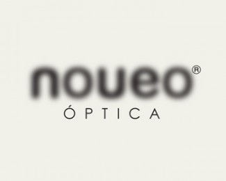
Idea Behind the Logo: We developed the naming and brand development of this optic center.
Our client asked us to create a brand for its optical center in the city of León (Spain), where they will commercialize young and avant-garde glasses with trendy designs. Both the name and brand design are presented to the consumer in a casual and friendly language. To reinforce the verbal concept of “no veo” (“I don’t see”), the letters of the logo are blurred.
http://www.logoblog.org/logo-design-gallery/
Este blog está diseñado para gente activa que quiere aprender y sorprender a todos los días. Soy una diseñadora gráfica especializado en packaging y comunicación. Aquí encontrarás las cuestiones de arte, el feng shui, el embalaje, la decoración, aplicaciones de software, todo lo que uno puede realizar desde casa y conocer algunas noticias importantes para el mundo de hoy y tener ideas para trabajar desde casa. Buena suerte y éxito para todos.
viernes, 22 de abril de 2011
TheDieline.com Materia sobre Plural Wine designer de Brand Session
"Design of a label for a multivarietal wine through the use of a meta-message: We use Pantone® chips with colors to identify with a particular grape varietal. Each time a varietal in the blend of this wine changes in the next vintage, the color of the chip changes.
The bottle is elegant with dark glass and square shoulders and slender and with great personality.The label is modern, clean and colorful, it reflects the plurality of grape varieties and anticipates the product features: fruits, intensity, vivacity... It incorporates the historic Osborne Bull while introducing a different -more modern- typography, consistent with the graphic presentation of the brand. Loyal to its concept of plurality, each year the label will reflect the changes of the grapes that will make up the assemblage of that vintage."
Designed by Brand Session
Suscribirse a:
Entradas (Atom)